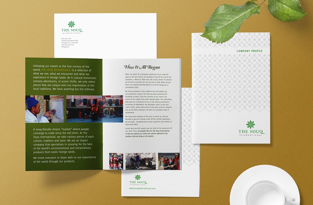
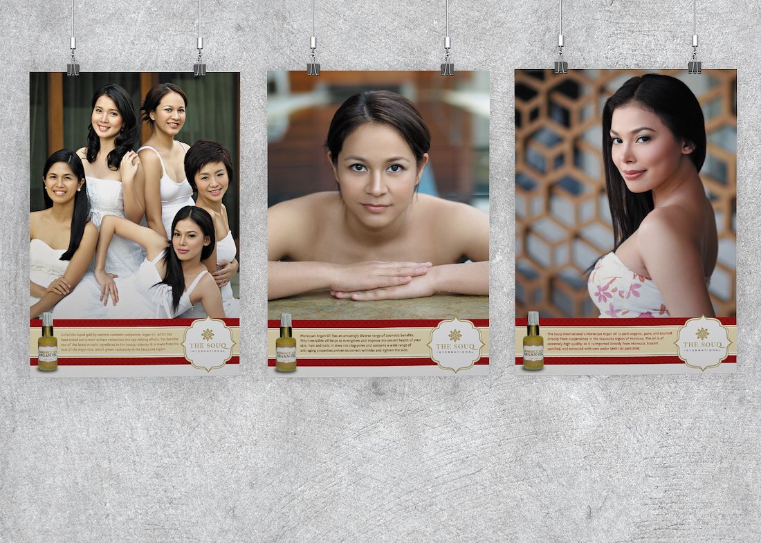
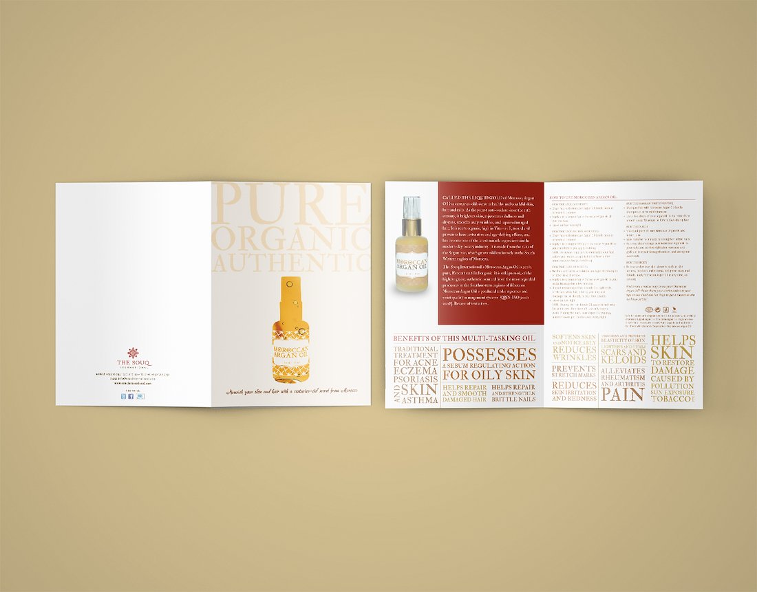
The Souq International was an importer and wholesaler of Moroccan, Greek, and Portuguese products in the Philippines. Their aim was to sell products that would introduce new designs, sensations, and cultures to Filipino customers that would bring to mind adventures in foreign lands.
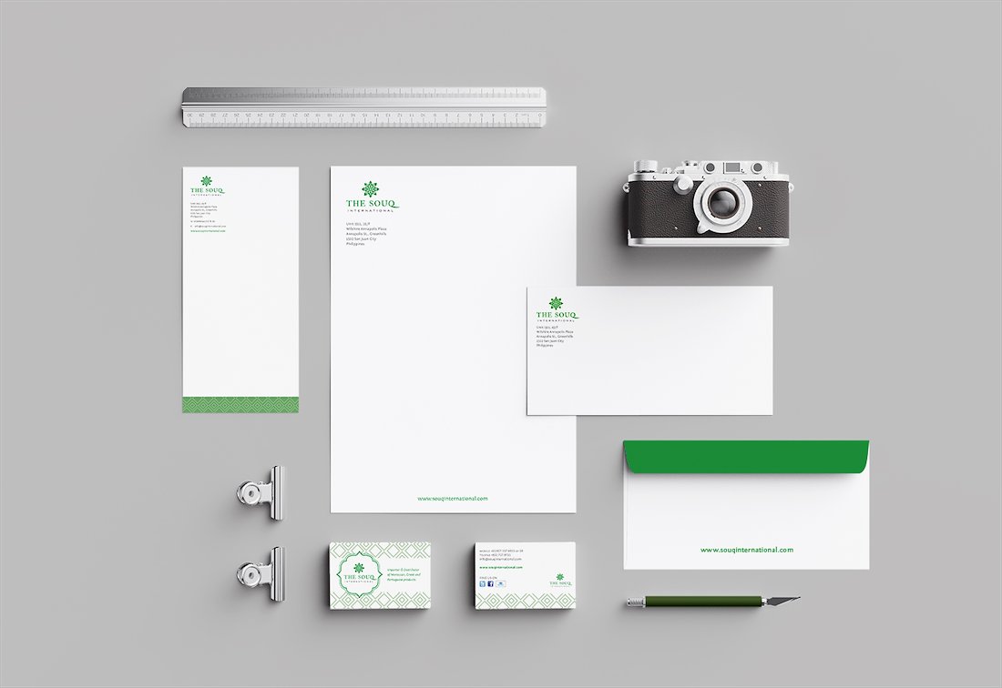
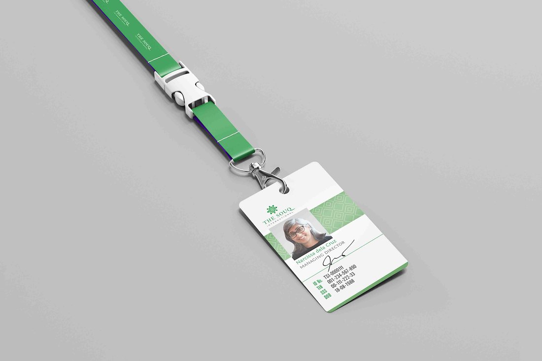
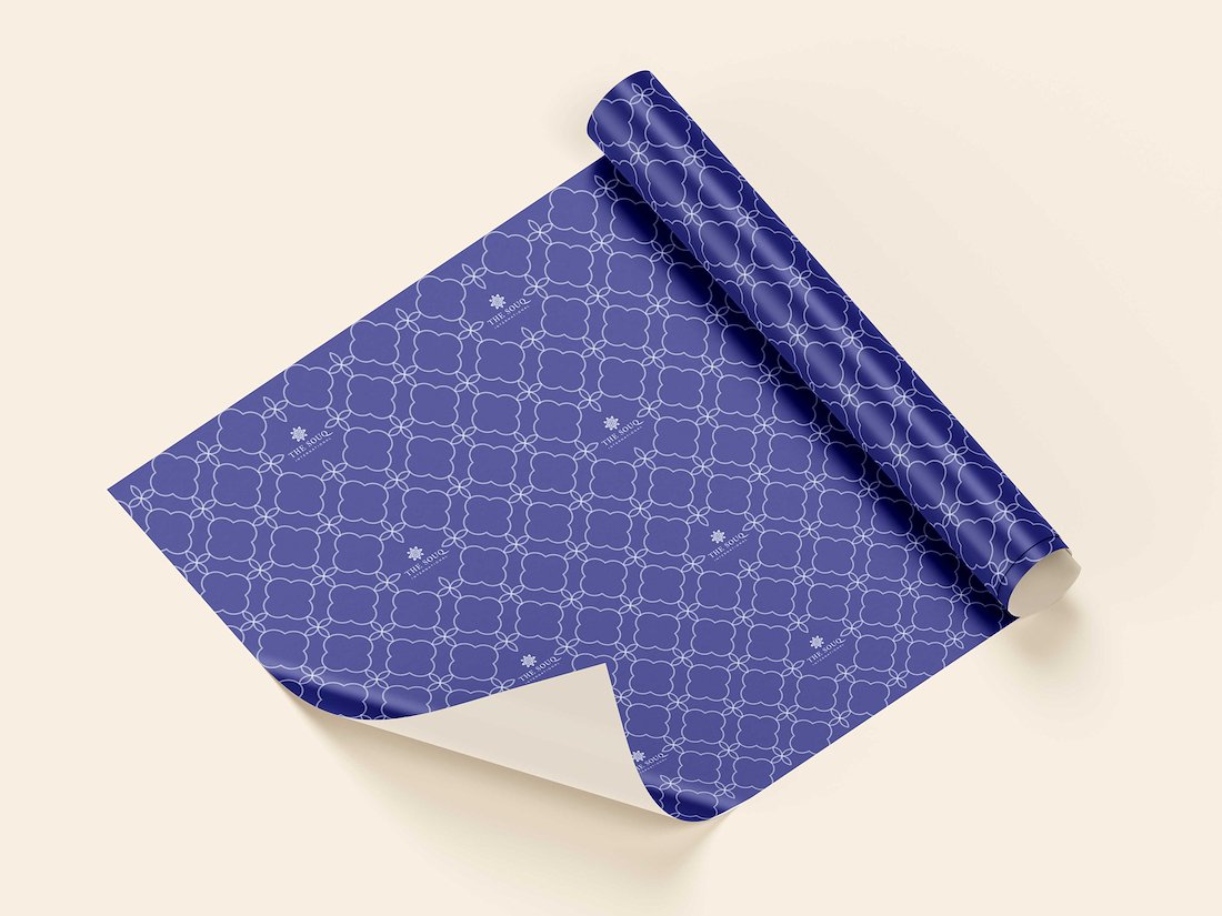
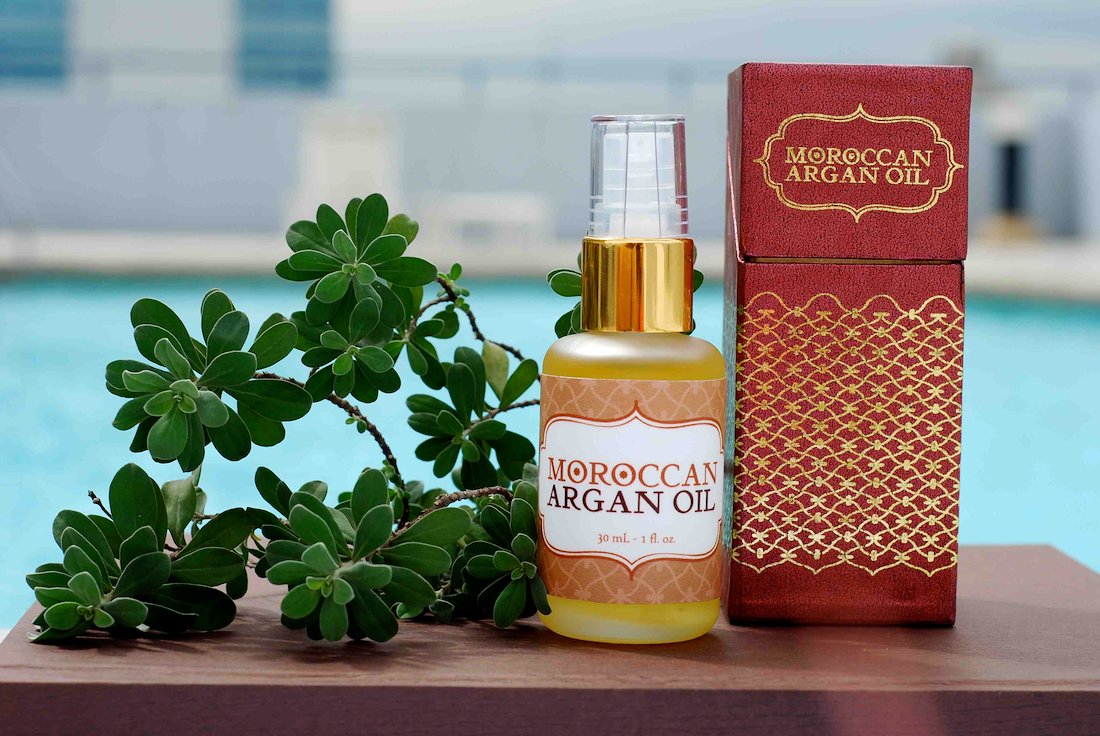
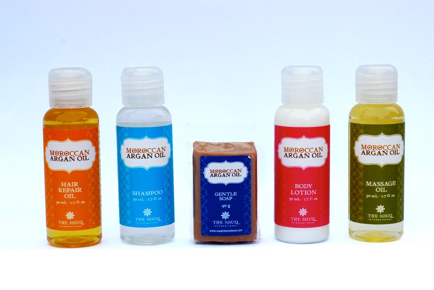
The Souq International required a corporate identity, promotional materials, and packaging to showcase its offerings in the retail industry. The initial impression would position the company as the exclusive source for high-quality Moroccan, Portuguese and Greek products.
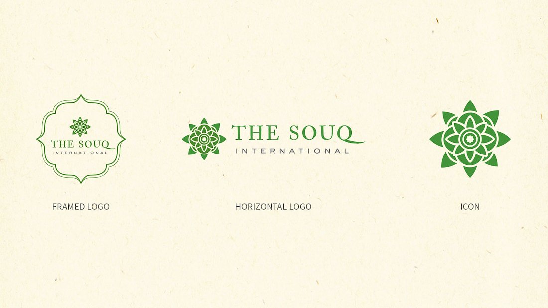
The logo brings to mind the feeling of being in a dusty Moroccan market, exploring and finding treasures. The color green is used to represent fertility, growth, nature, harmony. In Islamic culture, it is associated with paradise. Gray as a secondary color represents transparency, stability, and reliability—qualities that The Souq strove for as a company.
